Building an analytics platform, with prototypes real enough to sell from before it existed
Opensignal · Product Design Lead · 2016–2021
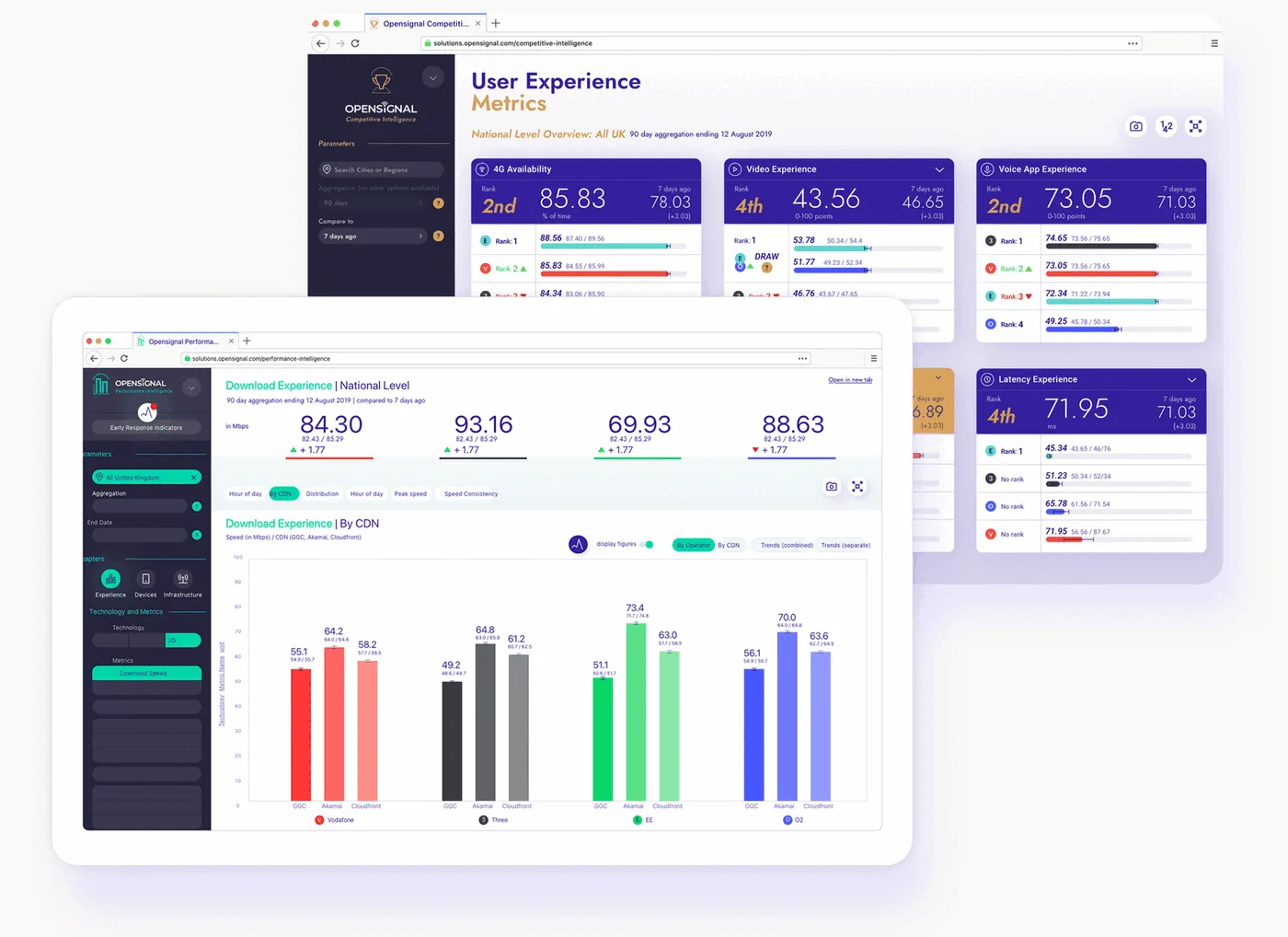
Context: from data company to intelligence company
What I owned: Product discovery, prioritisation (RICE), information architecture, and strategic direction for a 4-product platform serving 4 distinct audiences (C-suite, CTO, marketing, field engineers). Direct line to the SVP of Products through hypergrowth (20 to 300 people) and acquisition.
Opensignal collects billions of mobile network measurements weekly from consumer apps like Meteor. The B2B business monetised this data by selling analytics to telecom operators, Vodafone, AT&T, Free, EE and others. But the company's ambition was bigger: shift from being a data vendor to being a competitive intelligence partner.
In 2017–2018, the strategy moved from public reports to a SaaS platform model. I led product discovery and drove the platform build during hypergrowth, from 20 to 300 employees, through to acquisition, with no established product process and direct accountability to the SVP of Products.
The challenge: each audience within a telecom operator had fundamentally different questions, technical literacy, and decision-making contexts, but they all needed to trust the same underlying data.
Two products, two mental models: same data, different questions
We settled early on two products rather than one dashboard with permission levels. The C-suite and the engineering team don't only have different access needs, they have entirely different relationships with the data, and one product built for both would have served neither.

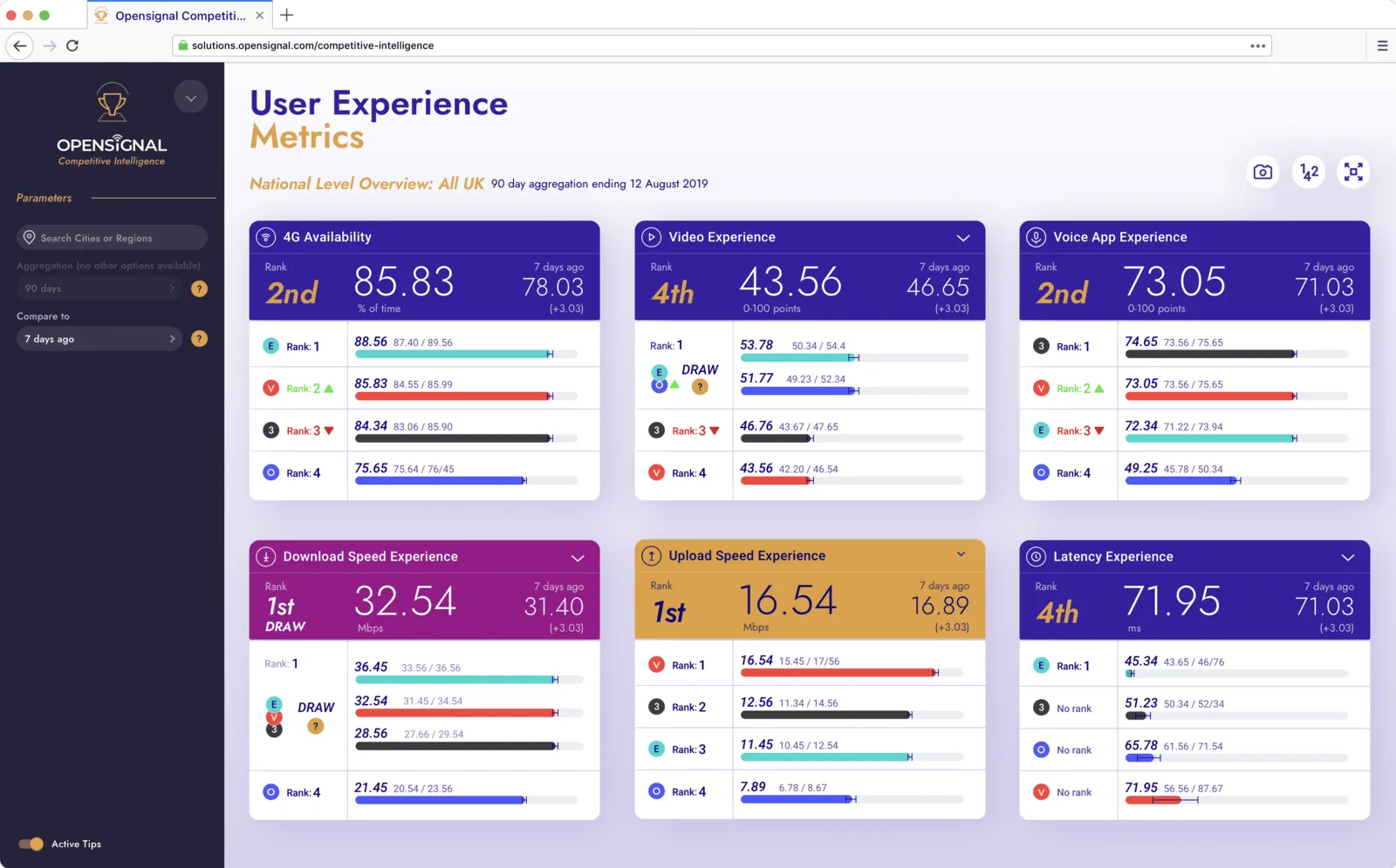
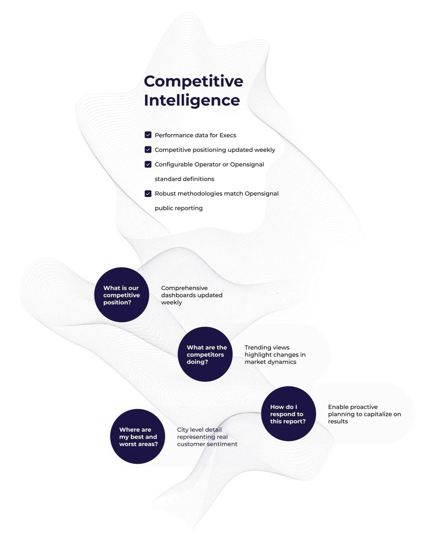
Competitive Intelligence
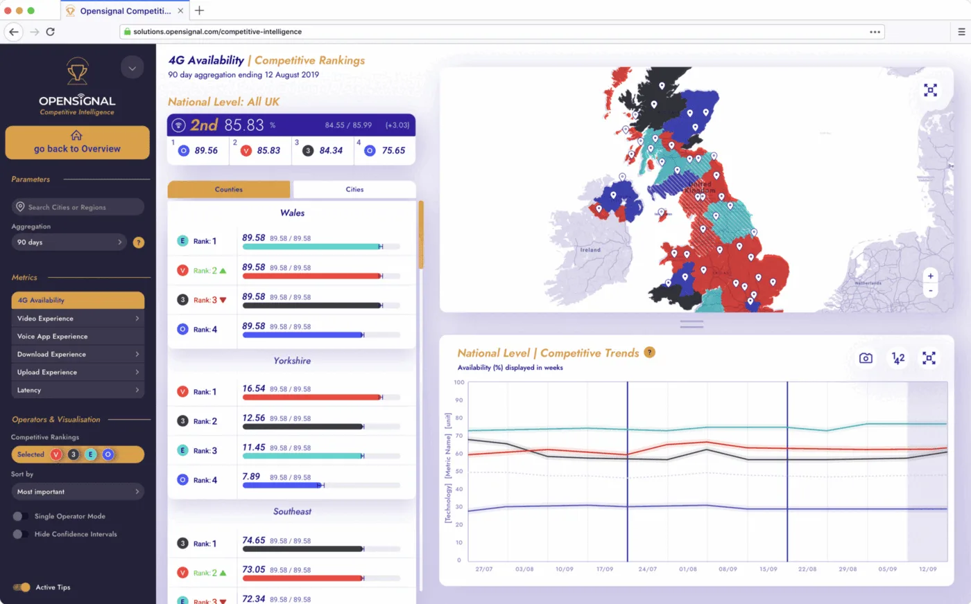
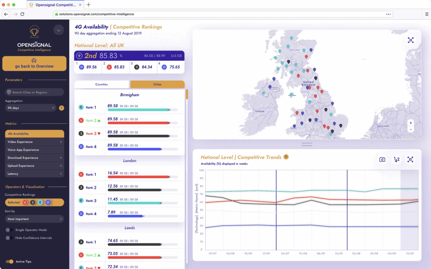
Executives want a 30-second answer: "How does my network rank against competitors, and is our position improving or declining?"
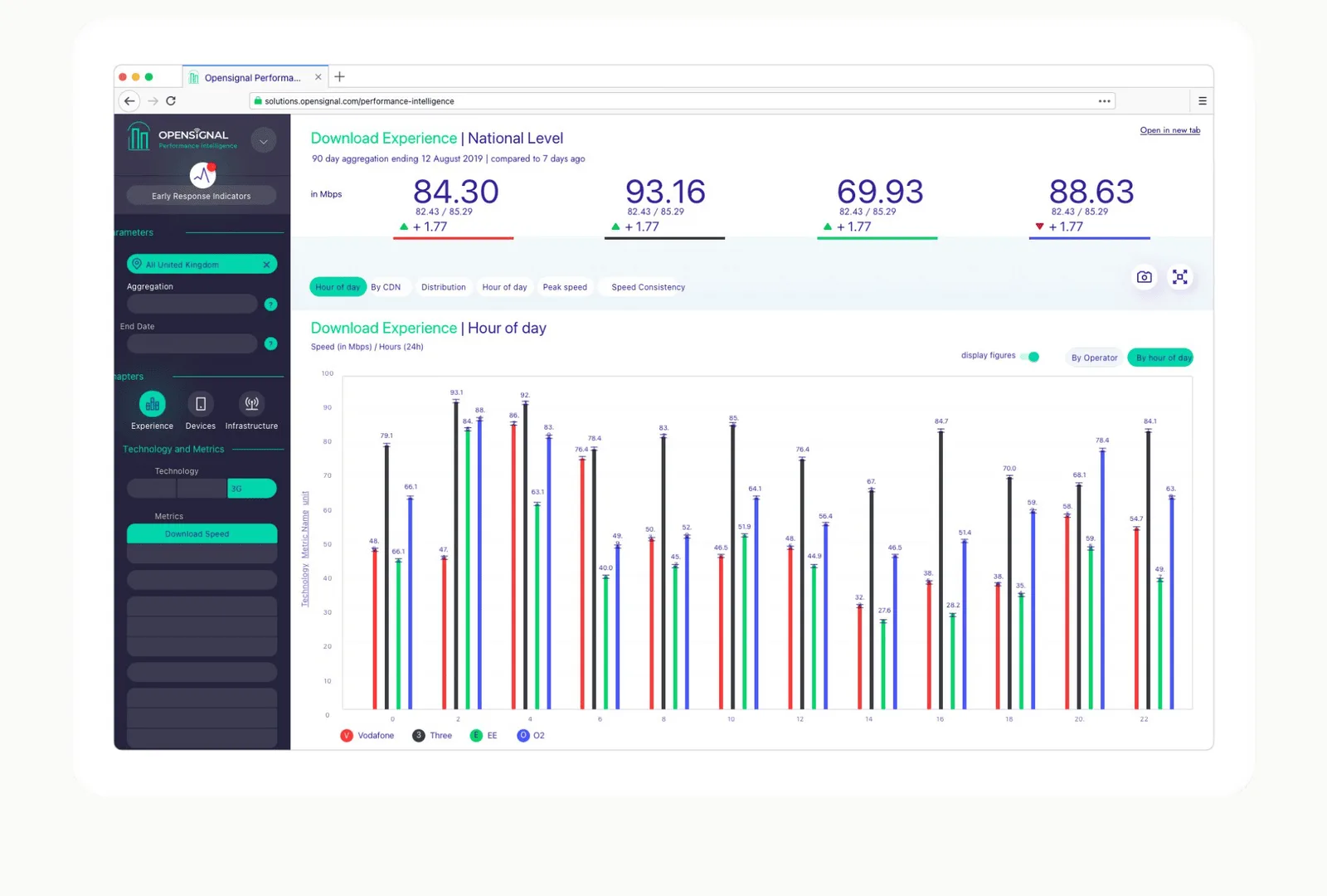
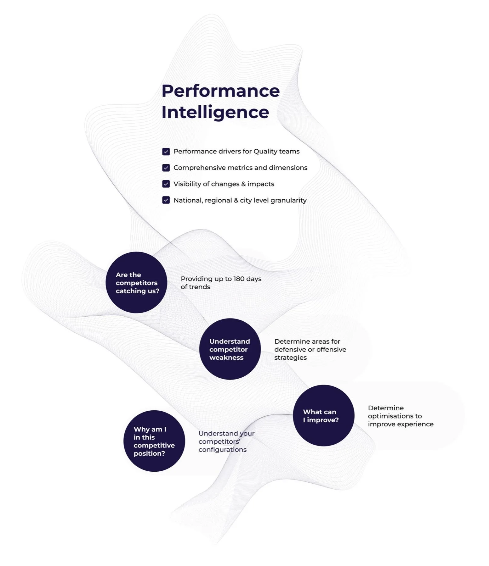
Performance Intelligence
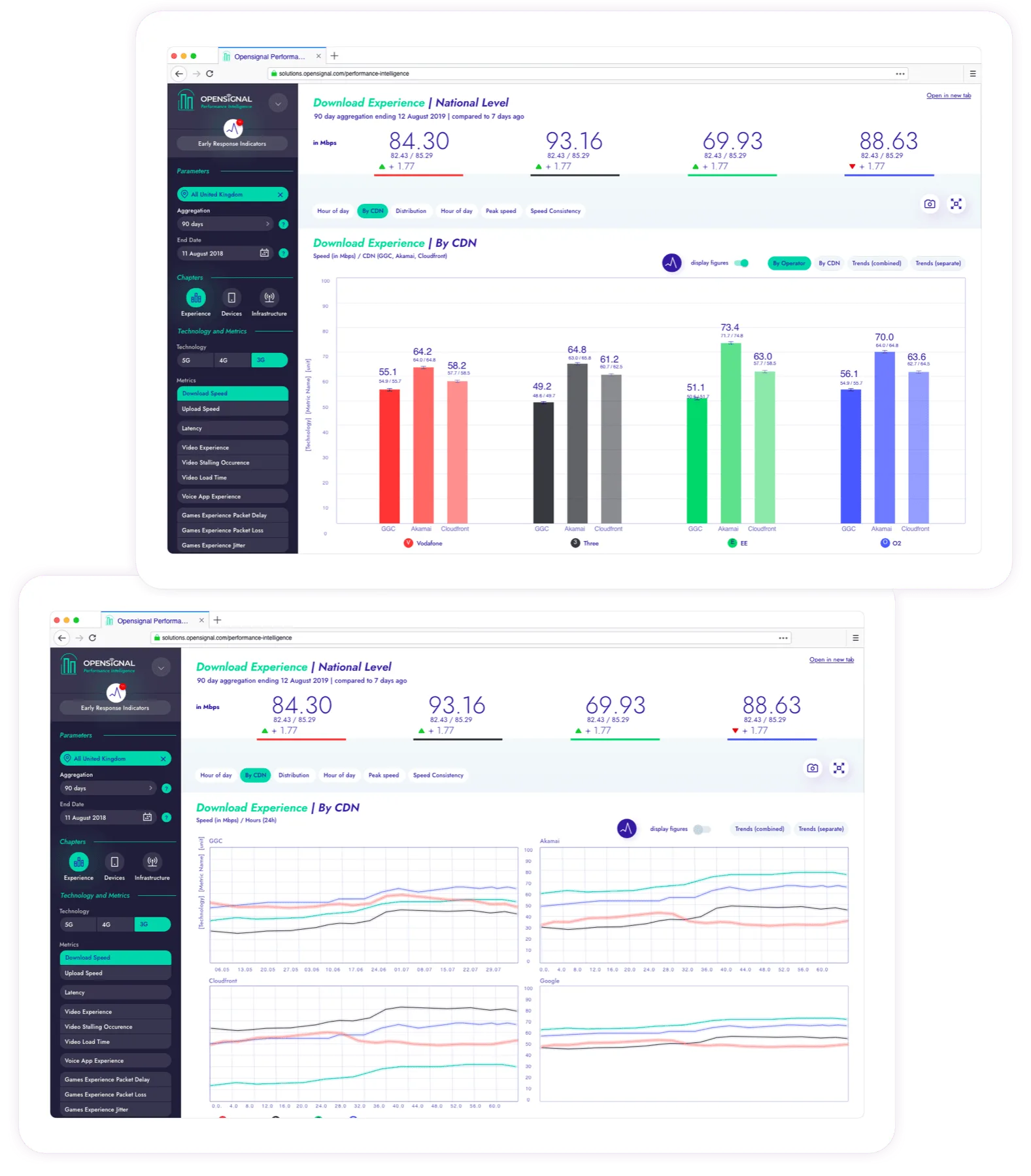
Engineers want deep decomposition: break speed into peak speed, consistency, time-of-day patterns, regional distribution.
Market gap: what existed, and why it wasn't enough
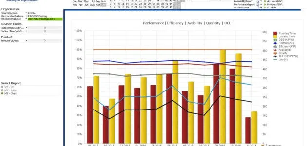
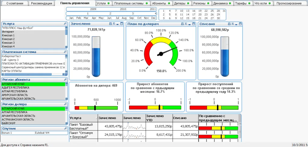
In 2017, before we built anything, I benchmarked two categories, not one. Telecom analytics, where the incumbents were probe-based tools pitched at network engineering, and the general analytics platform category, Looker, GoodData, MapD and Phocas, where the conventions for representing complex data were already being set. The gap was in neither category on its own: nobody was giving a telecom executive an interactive set of metrics they could read in thirty seconds and trust.
Nothing bridged executive decision-making and engineering diagnostics in one coherent platform. That was the strategic opening. Moving from data delivery to competitive intelligence meant the product had to do something none of the competition had attempted: make complex network data genuinely useful to business leaders as well as engineers.
Prioritisation: how I decided what to build first
With four products serving distinct audiences, prioritisation was the hardest ongoing challenge. I used a two-axis framework: client value (how much business impact for telecom operators, and how directly it served the intelligence-vs-data positioning) against engineering effort. The goal was to find the decisions that moved the strategic pivot forward fastest.
Two-axis framework: client value vs. engineering effort. Executive overview and ranking trends shipped first, fast to build, immediately differentiating in demos.
The executive overview and ranking trends went first, fast to build, immediately differentiating in sales demos. Regional drill-down and the shared component library were the bigger bets: higher effort but essential for the platform to feel like one coherent product family rather than disconnected tools.
How I worked: research first, then the roadmap
Research first. I ran user research directly with telecom operators, learned the analytical models from our data scientists, and used RICE to turn what we found into roadmap decisions. Industry standards and the data science team set what the metrics had to show. My call was how the platform presented them, and which problems we solved first.
Architecture before screens. The hardest problem here was information architecture. Opensignal's metrics are deeply complex: speed decomposes into sub-metrics, each available at national/regional/city level, across 2G/3G/4G/5G, with confidence intervals. I worked with data science teams to map every metric relationship before a single screen was designed.
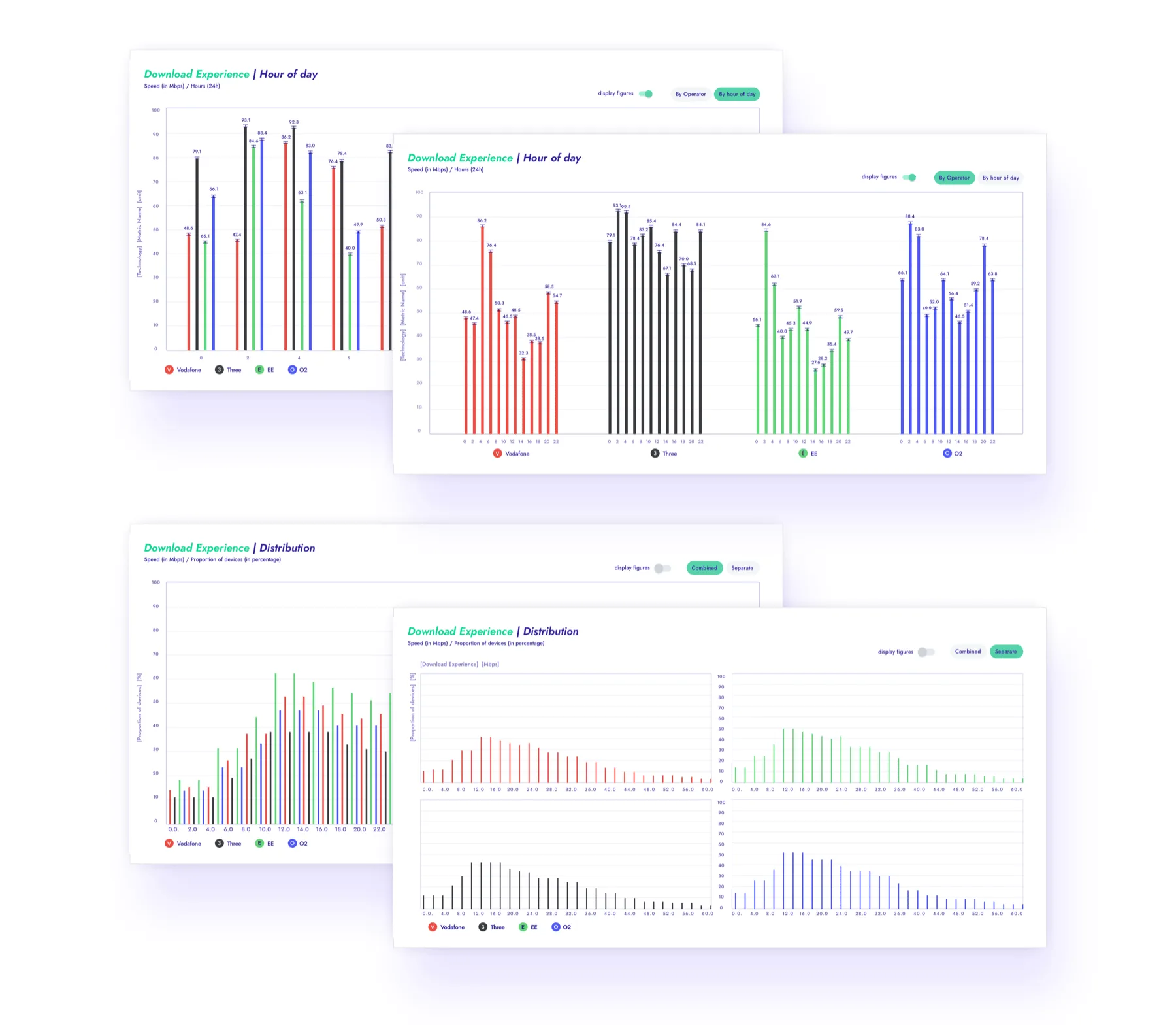
One design system, two density levels. CI needed white space and large trend indicators. PI needed data-dense views with multiple chart types per screen. I owned a shared component library (charts, filters, navigation, operator colour coding) while maintaining different layout grids per product. Both feel like siblings; each respects its audience's workflow.
How I learned what the product had to support
Working real cases through with our internal analysts is how I learned the reasoning the product had to serve. One of them stuck.
Rakuten Mobile was Japan's fourth entrant and its national average speed looked poor. The explanation was not that the network was bad. It was structural, and it was two things. Rakuten had almost no spectrum for 4G, a single band, with some regions limited to 5 MHz. And its national average was being dragged down by specific regions, Kyushu, Chugoku and Tohoku, where its own customers were roaming onto a competitor's network at a hard 2 Mbps cap.
That reasoning chain is why the product decomposes metrics, offers regional granularity, and shows distributions rather than means. Without it the feature list is arbitrary. With it, the feature list is the answer to a workflow a CTO actually runs.
Product 1, Competitive Intelligence: the 30-second C-suite answer
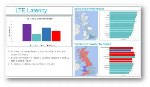
The core question I scoped this product around: "Where do I stand, and what's changing?" I defined an architecture that surfaced ranking positions across all key metrics with trend indicators on load, then allowed progressive disclosure into any metric. Every number included confidence intervals and methodology transparency, because C-suite users have high skepticism about data sources and low tolerance for anything that feels like a black box.
The critical business constraint: these are the buyers. They need to feel confident in the data before their CTO will sign a contract, so trust had to come before usage.
The C-suite buyer at a tier-one operator. Accountable for the competitive position, not for network detail. Arrives with one question: where do we rank, and is it improving. The objection is trust, "can we rely on your data", which is why every number carries its confidence interval and its methodology.
"It's very rare to see telecom operators lean forward and be actively excited by a demo, however, this is the effect Malgo's design has on customers. It's certainly a level above what they're used to."
– Iain Masden, SVP Products and Solutions, Opensignal
Product 2, Performance Intelligence: the engineering team's diagnostic tool
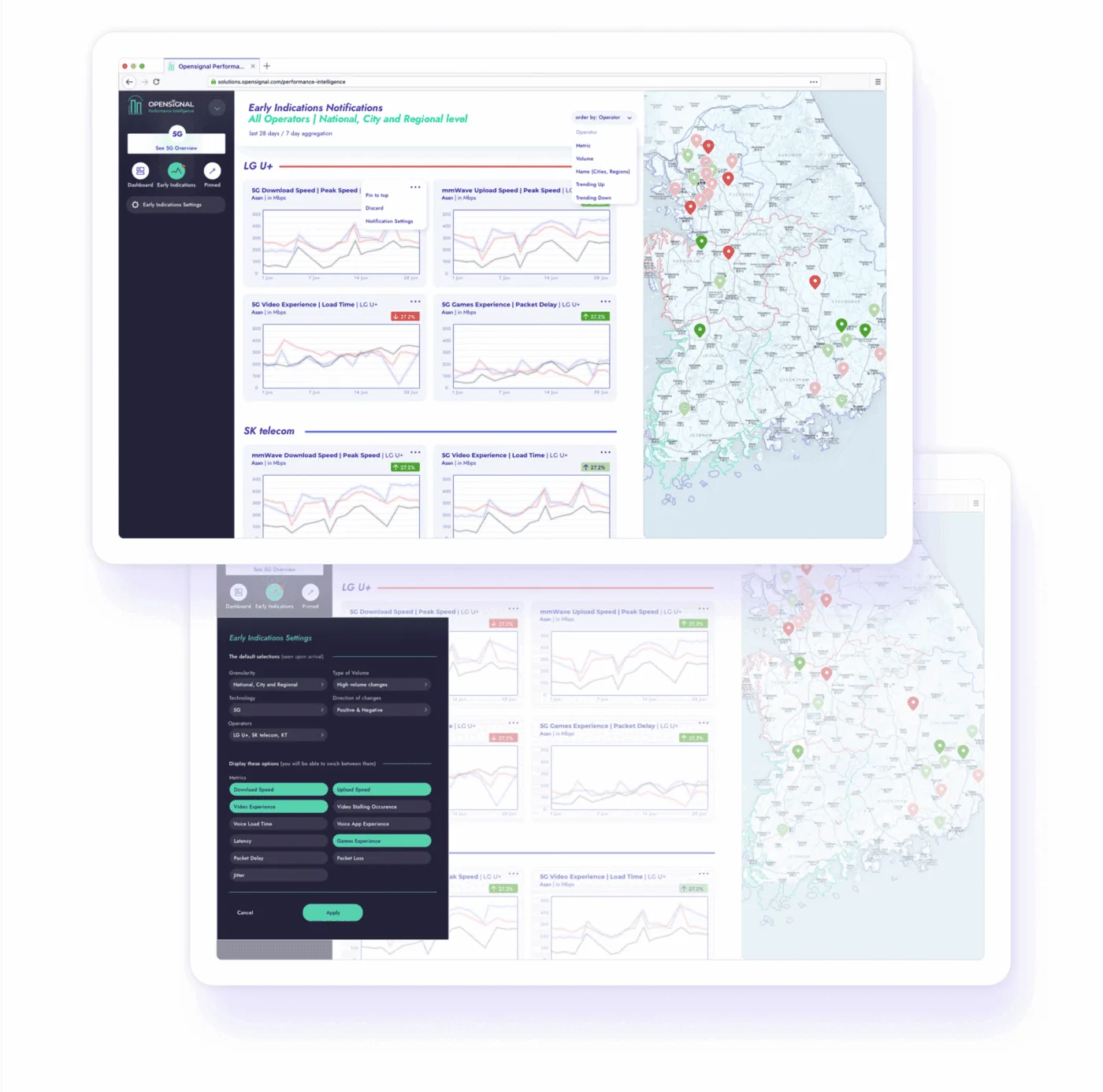
Performance Intelligence serves a fundamentally different workflow: CTOs and network engineers decomposing metrics to find root causes. The question I scoped this product around: "Our video experience dropped in Region X, is it a capacity issue, a throttling policy, or a specific CDN?"
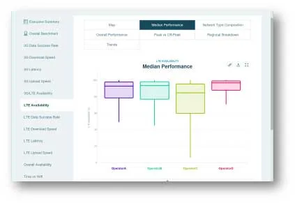
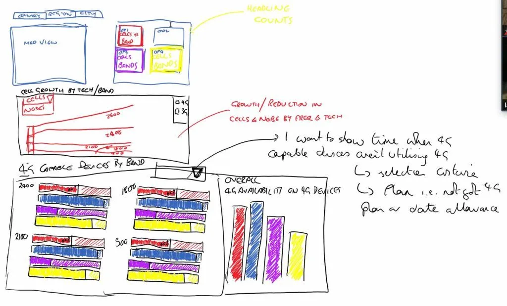
I defined a product that supported analytical storytelling, users build a narrative by drilling into data across dimensions. Linked charts that update in context, time-of-day patterns, distribution views, geographic breakdowns. The principle we worked to was density without confusion. Every screen is data-rich, but the hierarchy is clear.
The network engineering lead at a national carrier. Accountable for the technical position and for improving it. Arrives with the question that follows the headline rank: what is driving it. Needs to drill into specifics, the cities where a competitor is hitting capacity limits, how new device capabilities are being used on their network against a rival's. The objection is not whether the data can be trusted, that was settled a product earlier. It is whether the tool goes deep enough to act on.
The constraints the product had to absorb
I worked these out with the analyst and data science teams before the architecture was settled. Each one is a decision about what the product owes a sceptical buyer.
Confidence intervals on everything. Every reported metric carries one, calculated with Opensignal's data science methods.
Three levels of granularity. National, regional and city, for every metric, on standard internationally recognised area definitions.
Top-level metrics decompose into components. Video Experience into load time, stalling occurrence, data consumption and throughput. Speed into peak speed and speed consistency.
Aggregation over 30 or 90 days, with historical trends maintained.
And the constraint that made the architecture hard: not all technologies, 2G to 5G, are available for all metrics. That is an inconsistency the interface has to absorb without confusing anyone, and it is why the information architecture took longer to settle than the screens did.
Product leadership: what I owned beyond the products
Prototype-as-sales-tool: The Competitive Intelligence prototype validated the product internally and then went out into the field. Prototype fidelity was a deliberate investment to compress the sales cycle: sales used the prototype in enterprise conversations before the platform existed.
Cross-product coherence: With four products serving distinct audiences, I owned the design system that held them together, shared components, consistent interaction patterns, unified operator colour coding. This mattered commercially: operators expected a cohesive intelligence suite rather than a collection of separate tools.
Scaling through hypergrowth: As the company grew from 20 to 300 employees and through acquisition, we kept product quality and the research-led culture intact. My part was setting the standards, building the shared systems, and making deliberate calls about what not to build.

Outcomes: what shipped, and what it moved
Prototype fidelity was a deliberate investment to compress the sales cycle, sales ran enterprise conversations off the prototype before the platform existed.
Coherent platform family serving C-suite, engineering, marketing, and brand partnership audiences.
Maintained product quality and discovery culture through hypergrowth to acquisition.
Opensignal repositioned from data vendor to competitive intelligence partner, and the product was the proof point.
What I'd do differently: the two calls I'd change
I'd push for direct user research access earlier. Due to the seniority and scarcity of our target users (C-level telecom executives), we relied heavily on internal consultants as proxies for much of the discovery work. That created gaps we only discovered later.
I'd also advocate for a unified analytics layer across all four products from the start. Each evolved somewhat independently, and building cross-product consistency retrospectively was harder and slower than designing for it from day one.